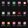
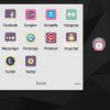
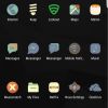
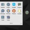
Android devices are best known for being open source for the most part, coming in different shapes and sizes, and have similar hardware and features among other things, but what a lot of users like or enjoy about Android is customization. Whether you’re rooting your devices to have more control over it or just slapping on a theme and an icon pack, there are ample customization options available for Android users. Icon packs are here to take you away from seeing the same old boring stock icons and everyone has different icons sets. One specific designer, Travis Hall, A.K.A. Not Just Another Designer, has come out with a brand spanking new icon packs called Serenity, Bayside, and Aura. I’m here to give you a quick review on these icon packs, so let’s take a look.
Ease of Installation
Let’s be honest here, installing applications is as easy as it can get, but I’m here to give you a refresher just in case you’re new to using icon packs. If you already have a theme downloaded, such as Nova Launcher, Action Launcher, Apex, or GO Launcher, you’ve already completed the first step. Next up is heading over to the Google Play Store and searching “Serenity icon”, “Bayside icon”, or “Aura icon” and you’ll see Not Just Another Designer’s app listed first. Install the application and once installed head over to your app drawer and either search (if an option) for the app or scroll to it. Lastly is applying the icons to your device. Aura and Bayside have the same menu, so in order to apply one of those icon packs, tap on the menu icon in the top left and choose apply. Look for the theme you’ve installed and tap on it. You will receive a pop up stating that icon pack will be the theme of your launcher. Applying Serenity is pretty easy too. Once in the app, tap the box with an arrow in it, and same as before, choose the launcher you have and accept the them.
After applying the icons, you have the choice to restart your device or hit the home button and view the icon pack. It’s not recommended to reset your device, but I do it just in case some apps don’t change over like their supposed to.
Difficulty/Ease of Use
All three applications were simple enough that someone new to icon packs can use, and I’m sure Not Just Another Designer was going for simplicity. I didn’t have any difficulty trying to figure out which app was which, though for Serenity, the messenger icons were similar. What I mean by the messenger icons was Google’s messenger app and Facebook’s messenger app. The color was different for each one, but I had to remember which app was which a few times. Aura and Bayside was no issue when it came to the messaging apps as those designs looked similar to the original app icon.
Productivity
For the most part, these icons packs were helpful when it came to knowing which icon was what. Again, the only time I had an issue was with the Serenity icon pack for the messenger app from Google and Facebook.
Enjoyability
I’m not sure how much time was spent on designing the icons and getting the right color scheme to go with them, but Travis hit the nail on the head with the colors. The wallpapers that come with the icon packs go extremely well with that pack and a few wallpapers I had of my own.
Price/Value
Like most icon packs, they’re either free or cost less than $5, but Just Another Designer left the price price tag at the low cost of $1.30 for Aura and Bayside and $1.40 for Serenity. Hey, even buying all three icon packs comes in under $5, so no need to spend your money elsewhere if you don’t have to.
Wrap Up
After using the three icon packs after a few days, I can say that Serenity would have to be my favorite because the colors are appealing to me. Sure, each icon pack is different, but they all have ups and downs. Not Just Another Designer has done a really great job on these icons and I expect more that come out to be just as awesome. Now, I’m just waiting for that icon pack that’s pastel and dark themed.
[rwp-review id=”0″] [rwp-review id=”1″] [rwp-review id=”2″]

