Apple made good on its promise of making Apple Music available to Android users this week with their second app on the Android platform. We saw what happened to its Move to iOS app and some of that has carried over, albeit to a lesser extent. Let’s take a serious look at Apple’s second Android app in our Apple Music for Android review, shall we?
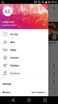
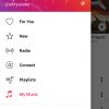
The app resembles the iOS version and a lot of the design elements make it clear that this is an Apple app. However, instead of directly porting the iOS app, Apple has put some effort into it, more than Play Store reviewers give them credit for. The hamburger menu or the slide-out menu is an Android standard and Apple has been critical of it in the past. However, Apple Music for Android includes it and this alone makes it quite clear that it’s an Android app. There are a lot of complaints that the app doesn’t completely follow Material Design guidelines, well, it’s a clean and functional design which also looks good. I’ve not had any issues with the way the user interface looks and in fact, it came as a breath of fresh air.
I’ve used Spotify in the past and for the past several months I’ve been using Rdio. Both services have been around for ages and I was curious to see how Apple Music would fare in comparison. And let me tell you, I have zero qualms with the service. Sure, a lot of people were critical of the fact that the music on Apple Music isn’t of the same bitrate as competing services, but frankly, you can’t really tell the difference. Signing into the app was a breeze, all it needed was my Apple ID. New users, however, will need to provide more including their credit card details, even for the three month trial. This is a standard across all services; if you want to access the trial, you have to store your credit card on file.
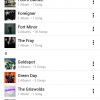
Once I was signed in, it showed me the same setup I went through a few months ago to choose my favorite genres and artists. However, Apple Music pulled my previous selections and I just had to edit them if I wanted to. Once the setup was completed, I could finally start listening! The app was refreshingly bug free for the most part, even though it has been released under the Beta moniker. I was able to quickly start downloading my favorite tracks, though I did run into some issues here. If I set one album or a song to download and then immediately set another also to download, instead of queuing, it would show the first album or song as downloaded even when it wasn’t and move on to the more recent selection. At other times though, it worked as it’s supposed to. I finally got all my music downloaded and started listening in earnest.
The player itself works well and I had no issues with it. If I do come across any, I’ll update this post with details. The player is similar to the one in the iOS version of the app. The album art takes up about half of the screen. Below it, we find a seek bar and the details of the song. We also find the standard Play/Pause, Next track and Previous track buttons. Each button is appropriately sized and easy to hit accurately. Apple has also included a Now Playing button to see the list of songs that are playing and a Heart button to allow you to like a song. We also have the traditional Shuffle and Repeat All/Repeat One buttons in between a Share option and an Overflow menu. The Overflow menu gives you more options such as downloading a song for offline listening and adding the song playing to a playlist.
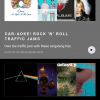
The Apple Music service is much the same. We have Connect, where artists can directly post videos and pictures to interact with fans. We also have Apple’s Beats 1 radio. Of all the different pages present, I found the For You page to be the most useful. Going by my listening history and my downloaded tracks, Apple Music recommended playlists and artists I might be interested in and I found it quite useful and accurate. The New section is basically a compilation of the most recently released albums and tracks and includes a Songs Chart. Apple Music does include some music which isn’t present on competing platforms. Taylor Swift is one big name artist, though personally, getting Metallica was a much bigger win for me. This says a lot about the power Apple has and could lead to benefits in the future.
The app is not perfect. It’s been largely bug free and overall pleasant, but scrolling was buggy sometimes. On one occasion, the app didn’t load anything, even though I was on a perfectly fine internet connection. On two occasions, the app closed when in the background when I opened a slightly intensive app. These are issues that Apple will probably fix by the time the app leaves Beta. For the most part though, it was quite easy to forget that this is a Beta version and I’m quite excited to see how good the final version will be.
There are some things missing. You can’t manage your subscription from the app and I had to use iTunes to switch from an Individual membership to a Family membership. The app also doesn’t allow you to add family members; you need a Mac or an iDevice to do that. I hope this changes soon; only then will Apple be able to truly sell the service to all users.
Wrap Up
The app works and works well for the most part. It makes it easy to listen to your music. There are some issues with scrolling and some other minor animation bugs, but given the Beta tag, I’m not really surprised and I expect these issues to go away soon. In fact, the app is much more stable and is smoother than the Rdio app, which has been around for ages. The service has been great, even on the “non-native” platform. Am I switching to Apple Music? In a word, yes.
[rwp-review id=”0″]We reviewed the free Apple Music app during the 90 day trial period
Last Updated on November 27, 2018.


