Earlier today I reviewed the Nokia Lumia 830 from a hardware standpoint. This article is a Windows Phone 8.1 review in which I take a look at the operating system itself, and in the final article I’ll be offering my thoughts as an Android user “making the switch” to Windows Phone. Let’s take a look at Windows Phone 8.1 and see how it stacks up. I’d like to note, as this was my first time using a Windows Phone, there may be some things in here that are specific to the Lumia 830 and not Windows Phone 8.1 itself as this device was running the Lumia Denim Windows Phone 8.1 update.
Windows Phone 8.1 Interface
I’ll admit, I’m a fan of Windows 8.1 on the desktop, and an even bigger fan of the direction Microsoft is going with Windows 10 from what I’ve seen of the preview so far. I also have an Xbox One so the Windows Phone 8.1 interface was really familiar from the start. Windows Phone 8.1 consists of three basic components: the lock screen, the Start screen, and the apps/games list.
Lock Screen
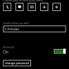
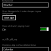
The lock screen is easy to set up and allows you to set a background app, toggle showing artist information when music is playing, select which app should show detailed notifications, choose up to 5 apps to show quick status, set the screen time out, and if a password is required. As well, one of my favourite features was the Glance Screen which allows you to see the time and other content at intervals or set times. You can also choose what information is displayed on the Glance Screen including date, detailed status notifications, quick status notifications, and the background app.
Start Screen
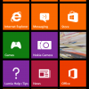
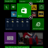
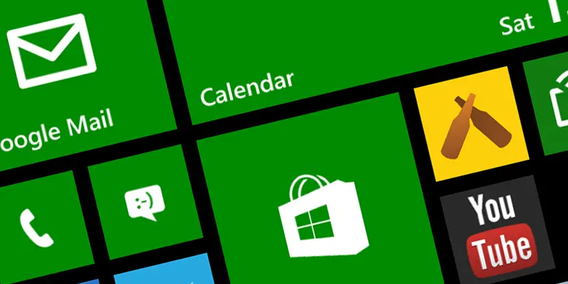
The Start screen (commonly referred to as the home screen on other devices) consists of a series of tiles, some static, and if the app permits Live Tiles which rotate through relevant information. The tiles can be set to three different sizes, and moved to snap to a grid. Any app can be added to the Start screen by pinning it in the app list. As well, and here’s where the limited customization comes in, users can set the tile colors for the system app tiles or set a background which will render the system tiles transparent and show the background with a text overlay for those tiles. As well, users can choose from a dark or light theme which changes the background color of Windows Phone 8.1 from black to white. Personally I preferred the darker look, and I’m sure using the dark background had a positive effect on battery life.
Apps List
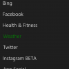
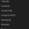
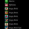
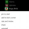
The apps list is a simple scrolling list which allows you to pin an app to the Start screen, add to kid’s/app corner, rate and review, share, or uninstall the app. You can also search installed apps, or the Store directly from the app list screen.
Settings Screen
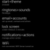
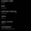
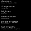
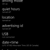
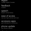
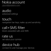
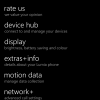
The settings screen is accessed by pulling down the notification shade and is split into system settings and application settings. Windows Phone 8.1 doesn’t group settings into similar items and as a result, the list consists of 50 different settings which can take a bit to scroll through. The positive to this however is that you don’t have to go digging into submenus to find that obscure setting you’re after.
Notification Shade
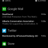
The notification shade works well no matter what you are doing on your device. A quick swipe from the top, or the side when in landscape mode, shows 4 quick actions and any active notifications. Notifications can be individually swiped away or clicked on to go to the app. The notification shade is always accessible, even when inside another app or game which allows quick access to your notifications no matter what you are doing on the device.
The one thing I was unable to find or figure out – and it could be a limitation of the device and not the operating system – was a notification light. Even though the Glance Screen shows detailed and quick notifications, if you missed the notification slide in, it isn’t always apparent that you have a message waiting.
Productivity
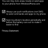
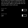
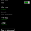
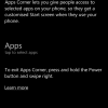
As mentioned above, there are 50 system settings which allow you to setup the phone for how you use a mobile device. The typical settings are there from ringtones to email accounts, connectivity settings to VPN and Internet sharing, and more. Windows Phone 8.1 also comes with a Find My Phone option, Quiet Hours, Data & Storage Sense to track data usage, and a Project My Screen option. One of the features I noticed when I first scrolled through the settings was a Kid’s Corner and Apps Corner features. Both of these allow you to specify specific settings and apps which limits what can be accessed when the either features is launched. This allows you to hand off your device to your child or a colleague and allow them limited access to your device without having to worry about them accessing apps or sections of your phone.
Pre-installed Apps
Windows Phone 8.1 comes with a slew of pre-installed apps. Again, some of these may be Lumia specific as other vendors offer their own versions of apps like Maps. The majority are your standard productivity type apps including Alarm, Calendar, Calculator, HERE Maps, HERE Drive+, Messaging, Music, Video, Photos, Podcasts, and more. Additional pre-installed apps include:
- Office, OneNote, OneDrive – Microsoft’s productivity suite for document editing, note keeping and cloud storage
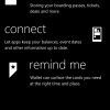
- Wallet – for tracking boarding passes, tickets, account balances, and more
- Travel – a trip planning app
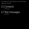
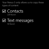
- Transfer My Data – a tool for transferring your data from another device via Bluetooth. I was able to transfer text messages and Contacts from my Nexus 5 to the Lumia 830 with no issues using this tool
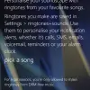
- Ringtone Maker – some people love their ringtones, and the inclusion of this makes it easy to snip out a ringtone from any audio file
- Cortana – Microsoft’s “answer” to Google Now, discussed further below
Gestures Beta
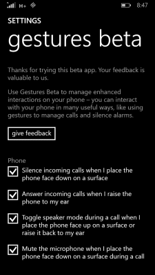
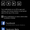
As I mentioned in the Lumia 830 hardware review, while I had the device, Microsoft released Gestures Beta. While it’s not pre-installed, I imagine down the road it will be and that’s why I’ve included it here. The app allows you to enable gestures to enhance user interaction with the device. Currently there are only four gestures available, but all worked exactly like expected and it will be interesting to see what other functionality is added to Gestures Beta down the road. The Gestures included are:
- Silence incoming calls when placing the phone face down on a surface
- Answer incoming calls when raising the phone to your ear
- Toggle speaker mode during a call by placing the phone face up on a surface or raising it back up to your ear
- Mute the microphone when placing the phone face down on a surface during a call
All of these are pretty basic but once enabled and used, they became second hand and I’ve already caught myself just lifting my Nexus 5 to my ear in order to answer a call.
Cortana
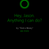
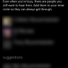
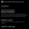
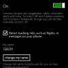
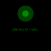
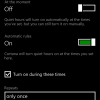
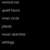
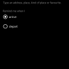
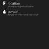
Again, as discussed in the hardware review, Cortana is Microsoft’s answer to Google Now and is currently in Alpha. After an initial setup, Cortana acted more like a personal assistant providing news updates, reminders, weather, and more. Quiet hours and an “inner circle” can be set up as well, allowing the phone to be muted during certain times while allowing certain people to still contact you. Cortana also offers a built in music recognition function. It does take longer to listen to the music clip as opposed to an app like Shazam, but it was able to accurately identify music in a number of settings including a very loud party with a lot of background chatter and noise. Cortana allows you to save favourite places as well which allow you to integrate location based reminders in addition to time based reminders. As I mentioned before, Cortana is currently in Alpha but is already functioning well and I can see it easily competing on the same level as Google Now and “OK Google.”
Enjoyability
I found Windows Phone 8.1 rather enjoyable to use once I got used to it – which didn’t take that long. It’s simple, almost to the point of being too simple, but it works and it’s very easy to find and access what you need to when you need to. Even though customization is limited, it was easy to switch the Start screen tile colours or set a new background image when using transparent system tiles. It would be nice to see some sort of ability to group settings and apps together, and I’ve seen mention that games used to be a separate screen as well. While there is a Games tile for the Start screen, it’d be nice to have separate app and game lists. Overall though, I really liked the Windows Phone 8.1 interface over my couple weeks of use.
Wrap Up
At the end of the day, every mobile operating system has it’s strengths and weaknesses. I’m sure I missed a few things as I only had a couple weeks to play with Windows Phone 8.1, but I found Windows Phone 8.1 to be simple and straightforward to use. The sliding animations added just enough motion to provide input feedback and the Live Tiles provided relevant information on the home screen. I can’t wait to see what Windows 10 brings to the mobile line up.
[rwp-review id=”0″]Last Updated on November 27, 2018.










Comments are closed.